01 — Affogata · B2B SaaS Product Design Case Study

    An A4 sketch became a B2B SaaS platform
    used by Apex, EA & Pokémon GO.

    Lead product designer — and the only designer — in a 6-person startup. No research budget. No safety net. Just a hand-drawn wireframe and a deadline.

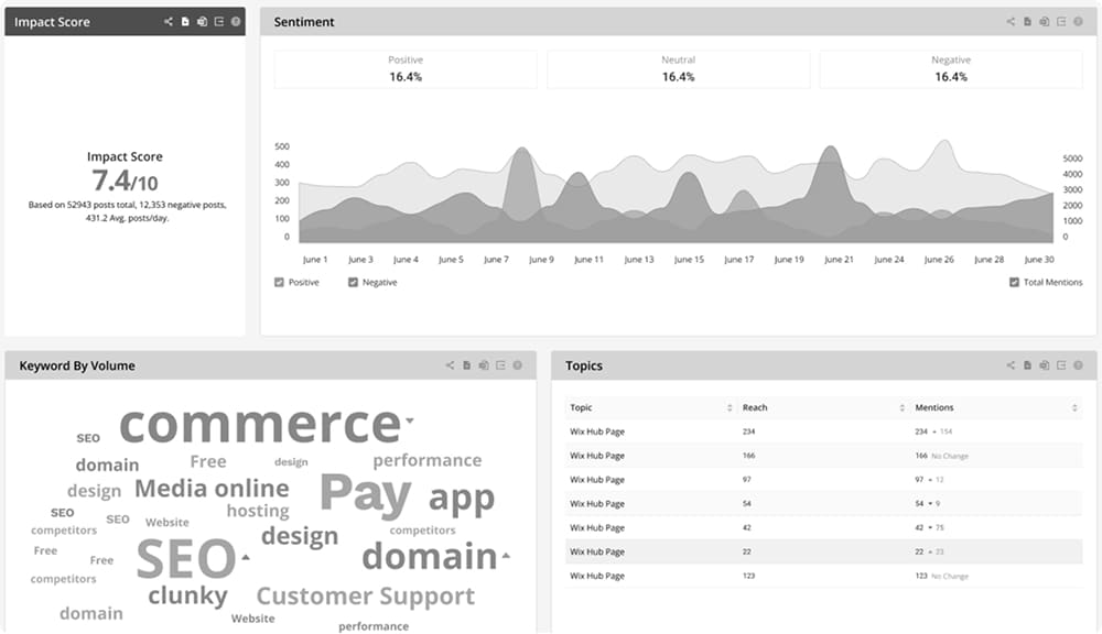
    Affogata B2B SaaS dashboard showing brand sentiment, trending topics and customer feedback volume
    Company
    Affogata (Communit)
    Duration
    6mo MVP · 3yr total
    Role
    Lead Product Designer (solo)
    Team
    PM · 2 Devs · Me

    My contribution

    Lead UX & Product Designer, end to end.

    I led the end-to-end design of the platform: information architecture, workflows, UI, and the design-system foundations the team built on. I worked day to day with the CEO, CTO, two developers, and the customer success team, and stayed close to enterprise clients through the company's move from a single-client tool to a B2B SaaS product. The same end-to-end approach shows up in my Push App and News Fusion case studies.

    The brief

    Design a platform to monitor brand health and respond to feedback in real time. Fast. Solo. Scalable for a future no one could predict.

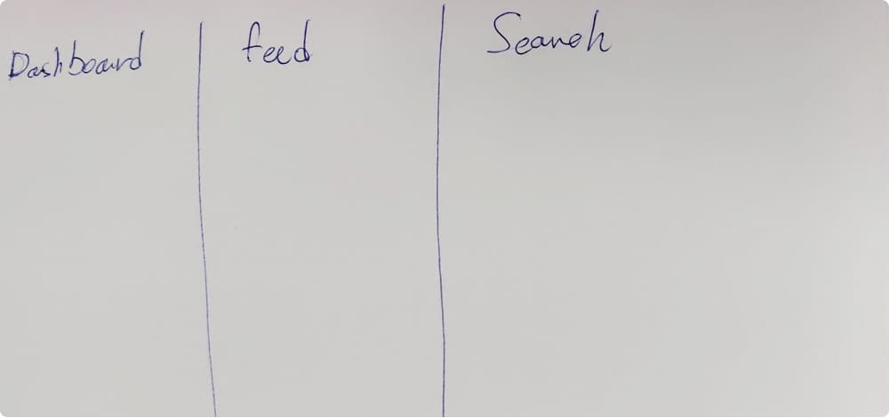
    Original hand-drawn A4 wireframe that became the Affogata dashboard
    The starting point — one A4 page
    01

    Dashboard

    Brand health monitoring

    02

    Feed

    All public posts & comments

    03

    Search

    Parameters to segment data

    Research

    No budget. No timeline. So I got scrappy.

    01

    Stakeholder intelligence

    Sat with the CTO and CEO to map the vision. Asked developers what was technically real. Learned what the investor-client actually needed to do. Later, CS became my permanent research channel.

    02

    Guerrilla competitive analysis

    Twitter's advanced search (CEO's mental model). Brandwatch and Sprout Social for enterprise conventions. What do power users in this space already expect?

    03

    Educated guesses

    Three roles need three views. Real-time matters for gaming communities. Familiarity beats novelty. Permissions need to flex as we scale.

    "Many of these assumptions were validated later when real customers arrived. But that day, I was designing on intuition and stakeholder input."

    Mockup → Shipped

    Early black-and-white Affogata dashboard mockup laying out widget hierarchy

    First mockup

    Shipped Affogata dashboard feed showing live posts and sentiment

    Shipped

    Decisions

    Five bets I made without a net.

    01

    Design system, day one

    Situation
    After early mockups, I knew we'd ship fast and consistency would break. With no design resources and limited dev time, I couldn't build everything from zero.
    Move
    Adopted Ant Design as the foundation — pre-built components for complex B2B, fast for devs to implement, customisable rather than from-scratch, enterprise aesthetic fit the target market.
    Trade-off
    Less custom UI. At startup stage, shipping beats perfection.
    02

    Three personas, three permission tiers

    Question
    Who actually uses this — and how do their needs split?
    Answer
    After stakeholder conversations, the system gets designed for three role tiers, each with their own permissions and surface.
    High-level management

    High-level management

    Full permissions. Creates and batches searches, sees everything teams build.

    Team leaders

    Team leaders

    Role-based access. Creates individual and team searches.

    Operational staff

    Operational staff

    Read-only. Sees what team leaders share with them.

    03

    Separate 'Respond' from 'Search'

    Anticipated
    CS agents need to respond fast. Team leaders need complex searches. Two fundamentally different tasks shouldn't share one interface.
    Designed
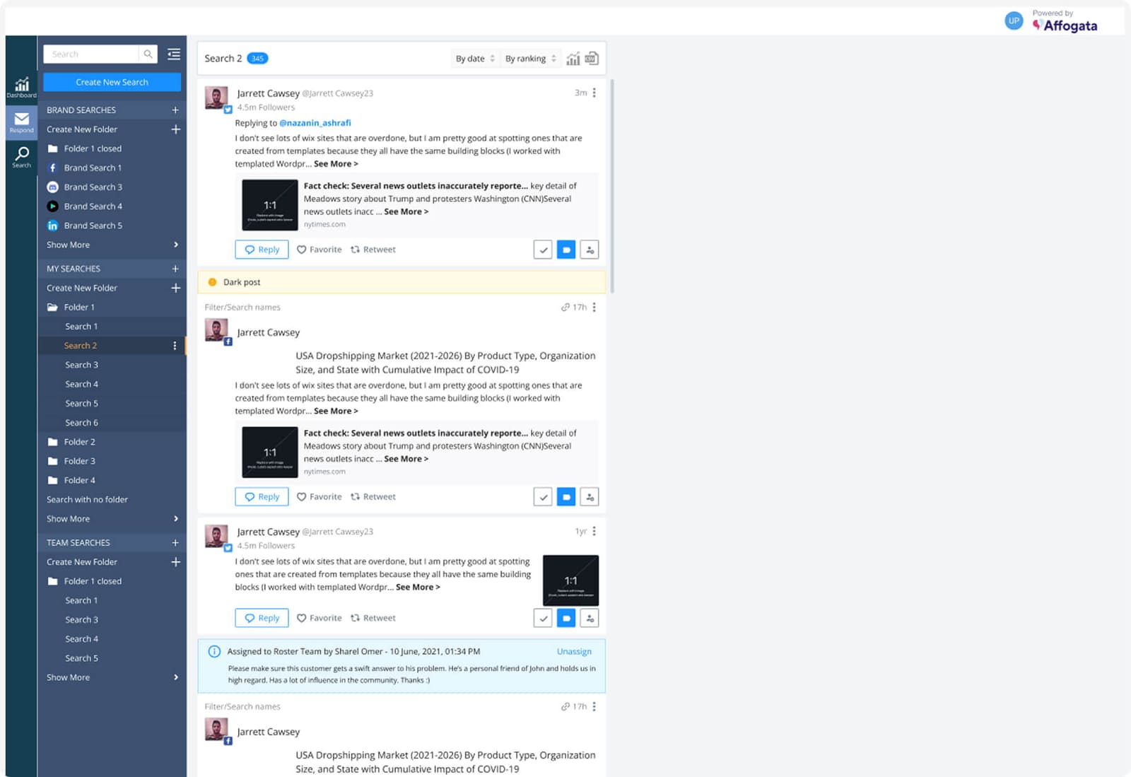
    A Respond screen — simplified, permission-limited, only feeds CS can reply to. A Search screen — full-featured for team leaders, complex filters, trend analysis.
    Why it mattered
    When CS teams arrived, they appreciated not being buried under features they didn't need. The split became more valuable when we pivoted to SaaS.
    Respond screen: simplified, permission-limited inbox for customer success agents
    04

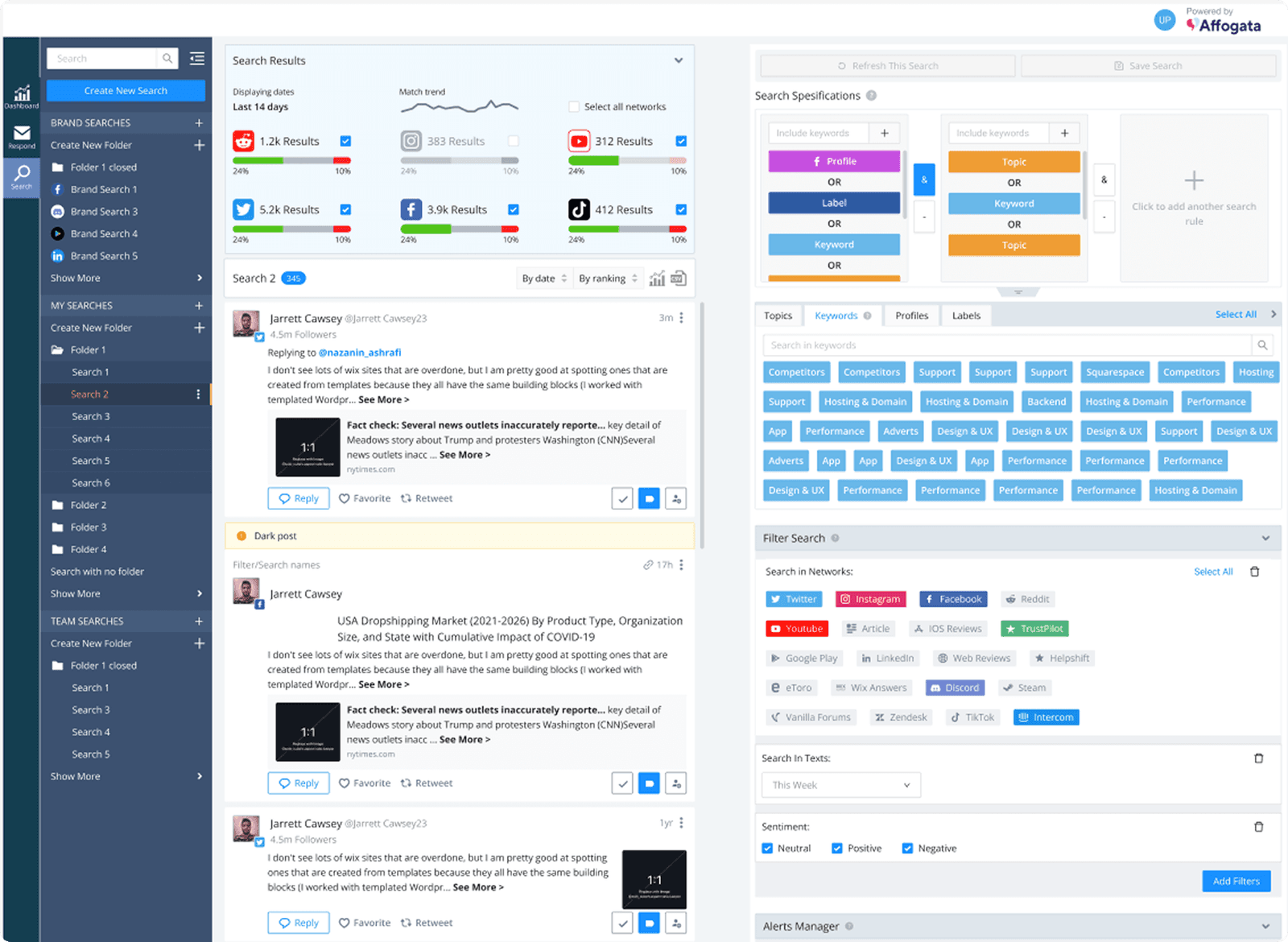
    A visual search builder (the biggest UX risk)

    Challenge
    CEOs wanted AND/OR boolean logic like Twitter's advanced search. Forms would be too complex for non-technical users. How do you make boolean visual?
    Shipped
    A drag-and-drop search system: searches as visual 'stacks' of filters, multiple stacks combined with AND/EXCLUDE, items dragged in from widgets, exclusions clearly marked, platform and sentiment filters toggled inline.
    Risk
    No way to test before launch. I was betting drag-and-drop was familiar enough and that visual stacks would make logical operators intuitive.
    Result
    CS reported team leaders picked it up quickly. Visual AND/OR worked better than a form would have.
    Visual search builder: a stack of profile, label and keyword filters1

    Step 1: Start with a stack of profile, label, and keyword filters.

    Visual search builder combining multiple filter stacks with AND and OR logic2

    Step 2: Combine multiple stacks with AND / OR operators.

    Visual search builder excluding topics and keywords to sharpen results3

    Step 3: Exclude topics or keywords to sharpen the search.

    05

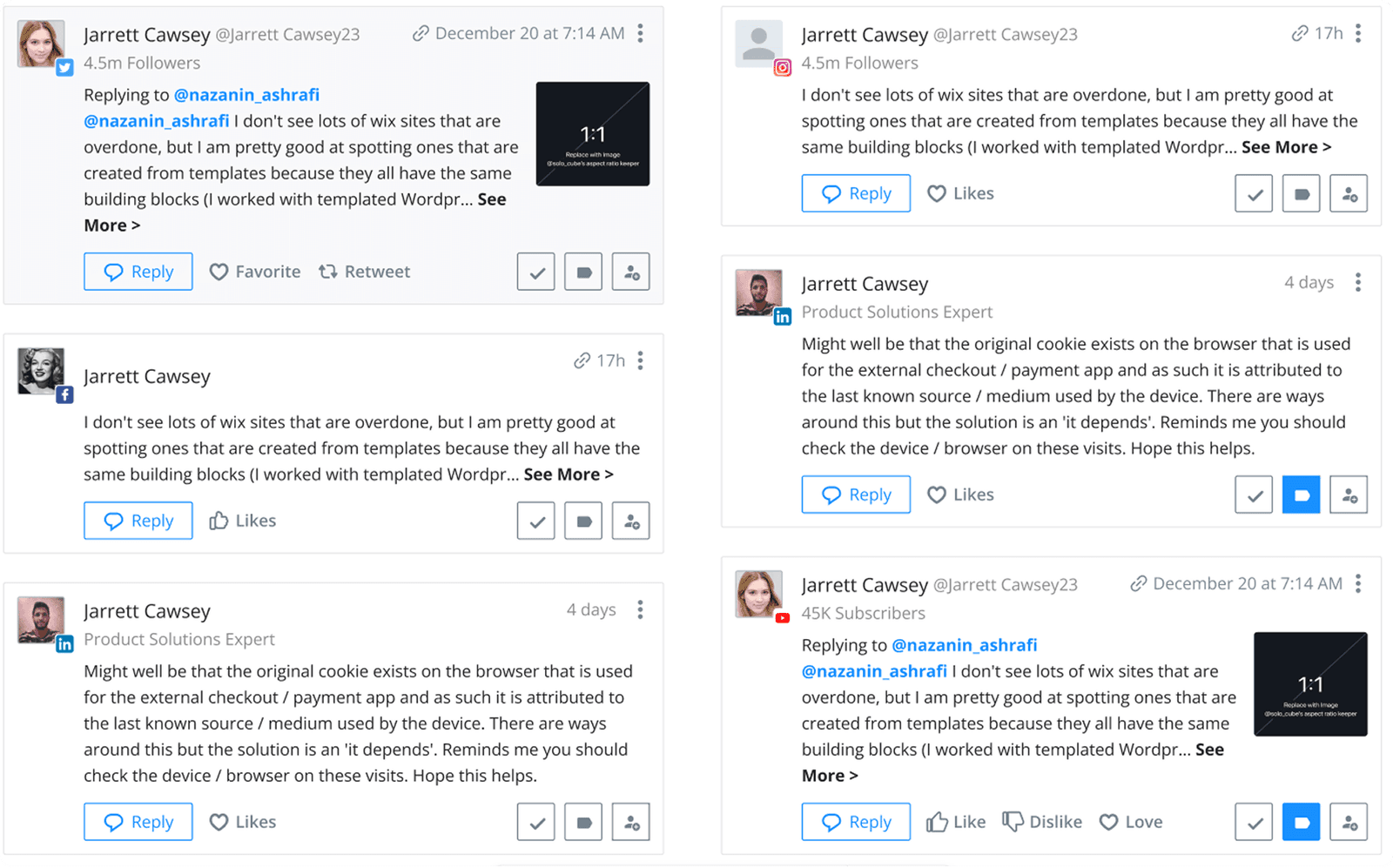
    Posts that look like their native platforms

    Rationale
    Users already know what Twitter posts, Reddit threads, and Facebook comments look like. Why make them learn a new pattern?
    Bet
    Familiarity reduces cognitive load. Even first-time users feel oriented.
    Validation
    Consistently named by CS as the thing that made the platform 'easy to understand immediately'.
    Feed posts styled to match their native Twitter, Reddit and Facebook layouts

    The dashboard

    Brand health, at a glance.

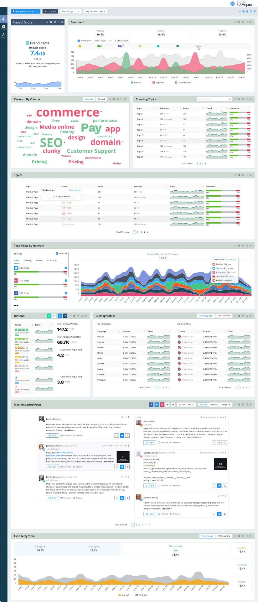
    Built for middle and top management — sentiment, trending topics, CS response times. Every widget earns its place by surfacing an action, not a number.

    Full Affogata dashboard: sentiment trends, top topics and customer success response times

    Outcome

    From one client
    to 12 SaaS customers
    and the world's biggest games.

    Apex LegendsEABrawl StarsClash of ClansPokémon GO
    12
    Companies using the platform
    60+
    Features designed & shipped
    3yr
    Core architecture stable
    1
    Solo product designer

    During my time there the platform grew from its first client to 12 SaaS customers, including teams behind major gaming titles. As we onboarded eToro and the gaming studios, CS reported new clients adapted to the platform quickly. Most requests were for more features — not fixes to existing workflows. The bones held.

    Learnings

    What three years without the textbook process taught me.

    1

    You Can Do UX Without Formal Research

    Stakeholder conversations, competitive analysis, dev constraints, and being ready to iterate on post-launch feedback got me 80% of the way.

    2

    Design for Flexibility

    Modular system, permission-based architecture, separation of concerns — these gave us room to grow without redesigning the core.

    3

    Speed ≠ Compromise

    Ant Design felt like compromising on uniqueness. It was the right call. Shipping "good enough" beat designing "perfect" slowly.

    4

    Constraints Force Innovation

    The visual search builder existed because complex logic had to be simple — without testing. Sometimes you innovate because you have no other choice.

    5

    Real Customers Beat Speculation

    When real clients arrived, their feedback was more valuable than any speculative research. The job was building a foundation flexible enough to receive it.

    Reflection

    What I'd do differently — and what I wouldn't change for anything.

    More stakeholder alignment earlier

    Push for clearer product vision before opening Figma. The single-client → SaaS pivot worked, but it left technical debt.

    Prototype the riskiest bet

    The search builder was our biggest UX risk. With more time, an interactive prototype tested with 3–5 potential users before any dev work.

    Document the why

    Many decisions were implicit. Writing down the rationale would have onboarded new team members faster — and prevented re-litigating solved problems.

    Previous projectNext project

    Interested in working together?

    Let's discuss how I can help bring your next project to life.

    © All rights reserved to Jonathan Shamir 2025